First Among Equals: Stanley Davis (1892–1938)

Stanley Davis was a key figure in the early development and artistic direction of the Railways Department’s design studio, Railways Studios. His posters, billboards and magazine covers carved out a promising design career, cut short by his premature death. MOTAT holds important examples of Davis’s work; some are highlighted in this blog, along with his wider contribution to the Studios’ significant role in helping build New Zealand.
Born in Gloucester, England, Stanley Davis received an art education in both London and Paris, and served as a lieutenant with the Canadian Artillery during the First World War. After immigrating to New Zealand, Davis started work at the Railways Studios in late 1922. His artistic talent and originality saw him soon rise to the position of supervising artist, with his designs for posters, brochures and covers for the Railways Magazine garnering much public approbation. In 1928, he was described as the ‘best commercial artist in New Zealand’. His work was widely acclaimed, nationally and internationally, before his untimely death (from heart failure) aged 45.
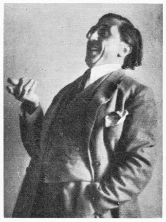
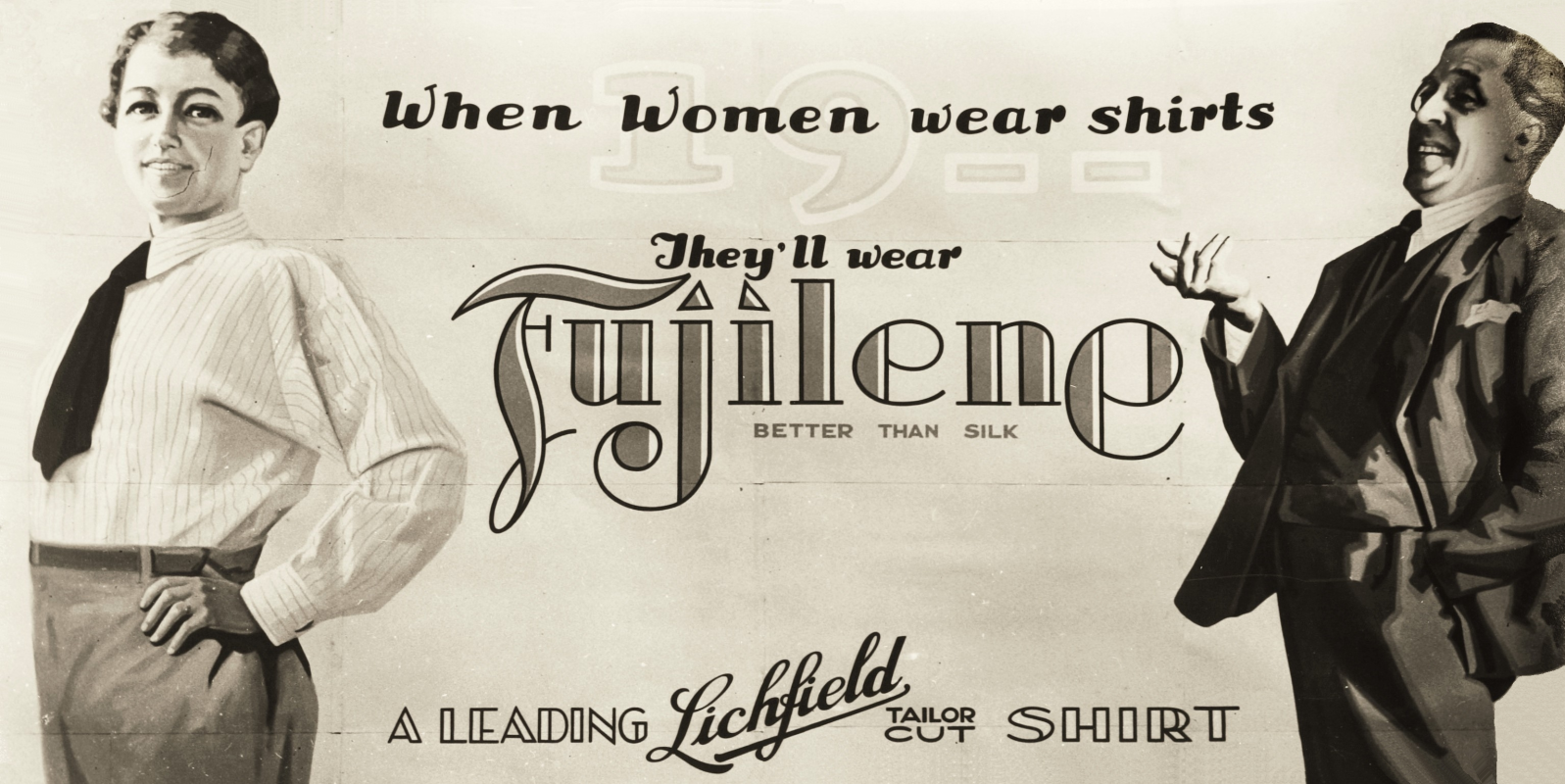
Well-known in business, advertising and art circles, Davis had a radiant personality and was ‘a genius for friendship as well as art’. In a tribute to Davis, the department’s publicity manager George Stewart noted his ‘exquisite appreciation of form and colour . . . The effectiveness of railway publicity in recent years owes a great deal to the co-operation and stimulus given it by the good will and genius of this king of artists.’ The department’s general manager, G H Mackley, said his death was ‘a loss to the whole country . . . He had an untiring eagerness to put distinctiveness into ordinary things.’ A photo of Davis in a jovial pose accompanied one of his obituaries; a photo likely taken to capture a pose (something the Studios’ routinely did) well-suited to a billboard advertising Lichfield shirts made with Fujilene.
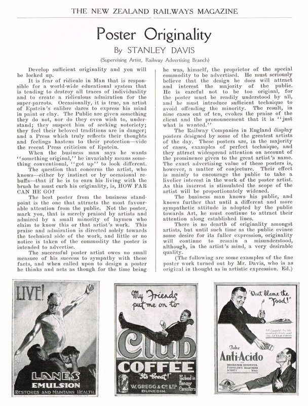
A glimpse into Davis’s artistic world comes from his 1926 article, ‘Poster Originality’, in the opening edition of Railways Magazine (the article is reproduced further below). Showing an outward focus, he doubted the effectiveness of some British railway posters designed by renowned artists, and suggested their decorative style encouraged the public’s interest in the artist instead of pushing a powerful main message. Warning that artists ran the risk of being ‘locked up’ if applying excessive creativity, he also lamented the conservatism of most business clients, while recognising the inherent trade-offs in producing commercial art.
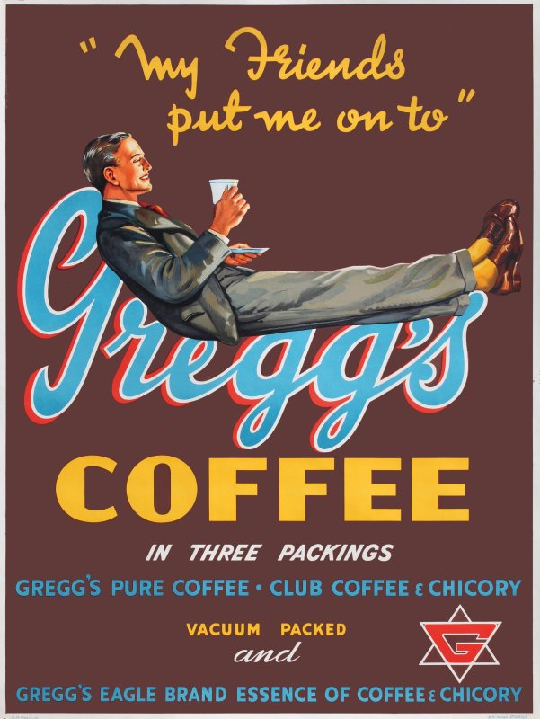
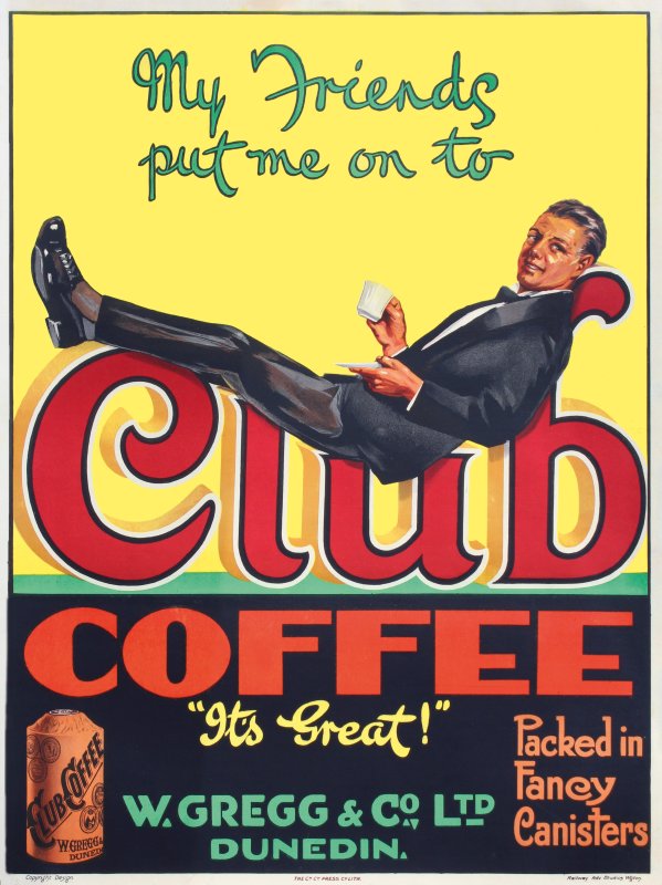
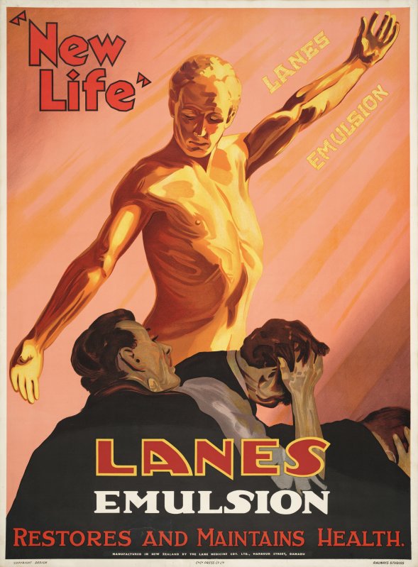
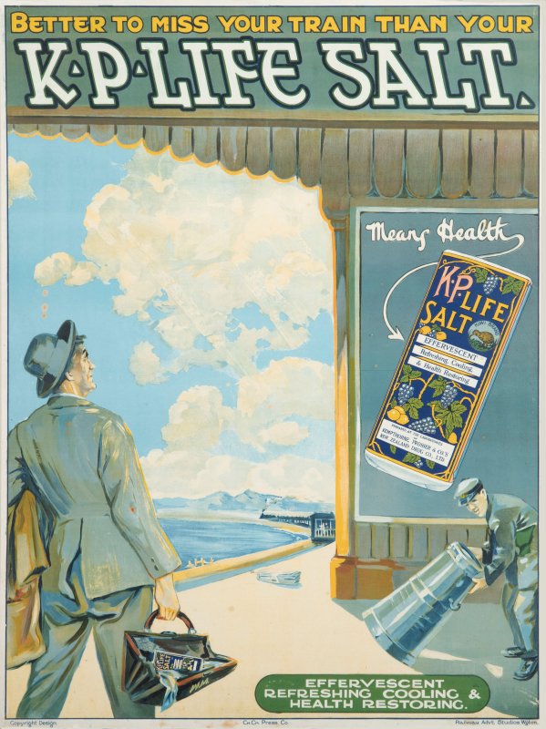
Judging by his posters, Davis certainly knew what he was talking about. Club Coffee successfully integrated typography and the human form to underscore the product’s benefit (a design that almost certainly confirms Davis as the artist of Gregg’s Coffee). Lanes Emulsion was more dynamic: ‘New Life’ was illustrated by the contrasting human states of radiance and despair, and the diagonally outstretched arms of the male model — like a parched ancient Roman figure reaching for water — added a strong dynamic design element. It must have pleased Davis when a visiting American commercial artist and manufacturer, Emil Bommer, dropped into the Studios to congratulate him on the work, calling the poster the best he’d seen in all his travels before taking two copies to ‘a collection of great posters’ in New York. (The same design was also re-used by the Studios around 1950.) K.P. Life Salt skilfully placed the product and advertising itself (a rail platform poster) into an everyday scene — a poster of a poster — and cleverly associated rail travel with prosperity and good health.
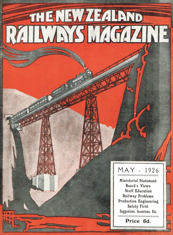
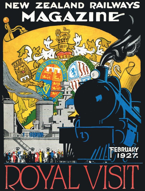
Davis also received high praise for his Railways Magazine covers, at a time when ‘fronts’ were often the only colour feature of such publications. Davis was the key figure behind most early covers, including the inaugural edition which featured a stylised view of a train soaring over the central North Island’s Makōhine Viaduct (the design also ran in different colours for the next five editions). Soon after, February 1927, Davis’s impressive cover to mark the Royal visit, full of pomp and pageantry, also reinforced the Royal tour’s reliance on the train.
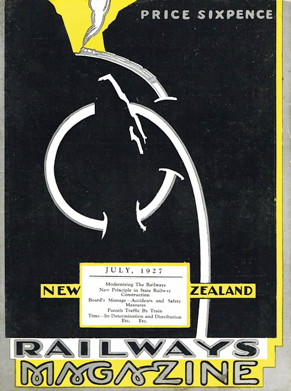
Another major rail landmark — the Raurimu Spiral — was Davis’s cover subject in July 1927 (and a further four times in different colours). Completed in 1898, the Spiral doubled back on itself, with the aid of tunnels and bridges, solving the problem of how to cross the steep slopes between the Central Plateau and the valleys and gorges of the Whanganui River (essentially by reducing the gradient of the descent/climb). Davis’s design is notable for its extreme simplicity: a stripped-back representation of the first part of the spiral for a northbound train. The looping typography of ‘magazine’ also strengthens the message. The cover is an early and noteworthy example of abstraction in New Zealand graphic design (and certainly the most abstracted of Davis’s known work), at a time when most local illustration was painterly and realistic in style.
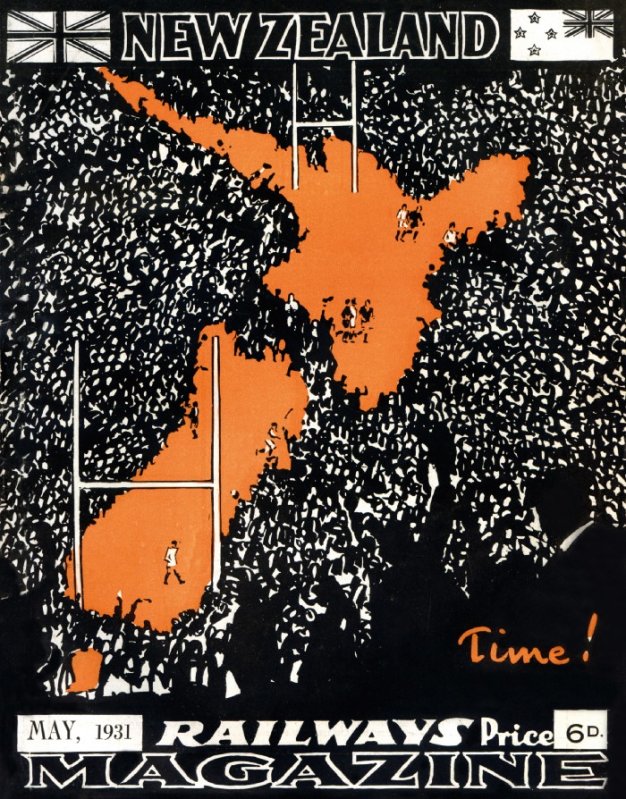
One of Davis’s designs also attracted international praise: his choice of a rugby-related image in June 1930 (also used in May 1931) — even if an error in the printing plates reversed the New Zealand flag. The art editor of the Baltimore and Ohio Railroad, Charles H Dickson, wrote:
‘I cannot discover whom to thank for this gem of an idea nor for its masterly execution . . . [it is] the flower of some nobly organised intellect. To have woven such a setting and such a national significance into one gripping picture is achievement almost enough for a lifetime. It is the most arresting “front” certainly of the whole year, and perhaps in a decade, and this from one with a life devotion to this subject.’
Reflecting on the evolution of Railways Magazine and Davis’s contribution after his death, O N Gillespie wrote that ‘the tradition of Stanley Davis is still preserved in the striking cover designs which make the magazine shine out like a jewel on the news-stands’.
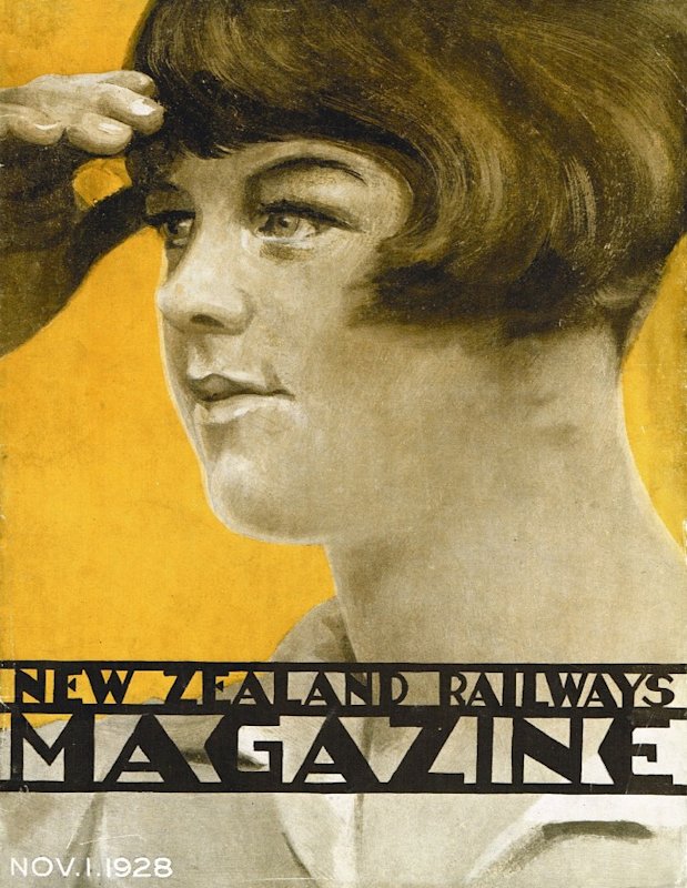
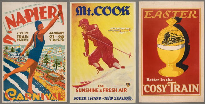
A further cover — November 1928 — was noteworthy for its stark difference, a portrait of a woman portrayed as a fashionable flapper, and provides a likely insight into Davis’s private world. The woman is thought to be Davis’s wife, Amy, based on her similarity to the woman depicted in two posters held by MOTAT (Napier Carnival and Mt. Cook For Sunshine & Fresh Air). The posters were accompanied by old hand-written notes that recorded the women as Davis’s wife, with a third note also recording she made the yellow tea cosy that helped inspire Easter — Better in the “Cosy” Train.
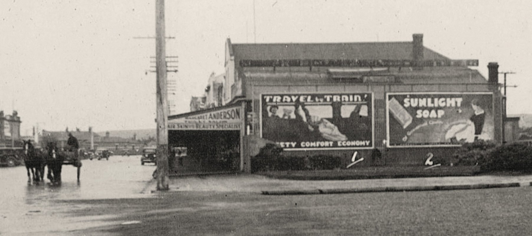
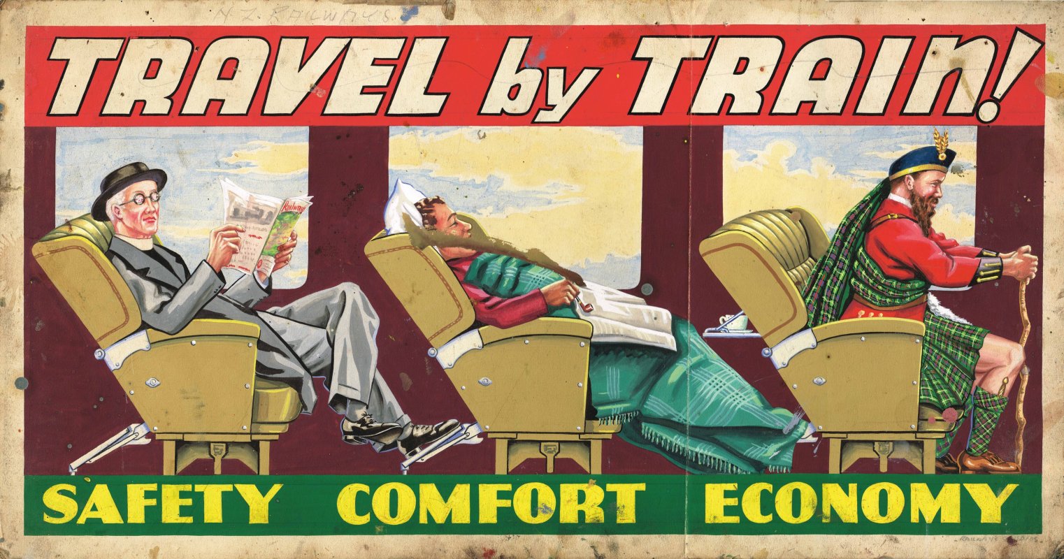
Alongside his poster and cover designs, Davis was the artist of myriad billboard designs: large-scale paintings that began to dominate the urban landscape in the 1920s and 30s. A stand-out example was Travel by Train!, a design that featured alongside Davis’s obituary in Railways Magazine. The billboard animated the department’s ‘Safety, Comfort, Economy’ slogan by matching a figure to each of the three promotional claims. A reader of Railways Magazine looks at ease; the middle passenger rests in comfort; and the tartan-clad man — a stereotypical penny-pinching Scotsman — reflects economy. The design shown below is likely to be a later version of Davis’s original, judging by the banner of the magazine being read by the left figure (that particular banner was used after Davis had died). An earlier version of the billboard — quite likely Davis’s — can be seen in a photo of a Gore street scene dated to the early 1930s.
Altogether, Davis was a pivotal figure in the Studios’ development, with both significant and enduring impact given his leadership role during the Studios’ formative years. More broadly, Davis made an important contribution to the development of New Zealand’s commercial art; a contribution that, perhaps due to his early death, has sat in the shadows of other commercial artists who produced more extensive portfolios through longer lives. With the publication of Railways Studios (2020), Davis’s role and contribution to the railways, commercial art and New Zealand can now fully shine.
References
References for the blog can be found in Railways Studios (2020)
About the author

Peter Alsop is a senior executive who has worked across the public and private sectors.
He is a keen collector of New Zealand art, with particular interests in tourism publicity, hand-coloured photography and mid-century New Zealand landscape paintings.
He is the author and co-author of numerous books, including Promoting Prosperity, Hand-Coloured New Zealand and Scenic Playground.